When I began working on my Portfolio post for the Nobel Prize given for Blue LEDs, the Information for the Public pdf was not yet available from the Nobel website. These pdf documents are designed to explain to the public the reasoning and history behind the choice to award a Nobel Prize to a particular discovery.
Since I’m trying to learn what makes a good image, I’ve decided to compare my choices with those of the official Nobel pdf.
Purpose:
First I want to keep in mind that our purposes are slightly different. The Nobel pdf is designed as a text document with accompanying figures. My purpose was to use only figures with legends to tell a visual story about why blue LEDs are important.
Illustration Style:
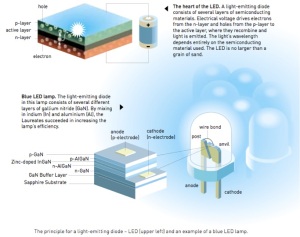
The Nobel images are very professional looking with small details like the blue LEDs in the background of Figure 1. In comparison, my figures are rather crude looking. I have just begun to teach myself Adobe Illustrator so I often find myself limited by the tools that I know how to use.
Amount of Scientific Detail:
The science described in Figure 1 is more accurate and detailed. Figure 1 shows an active layer between the n and p layers that is important for producing light. It also shows the different substrates (like sapphire) that are necessary to make a blue LED.
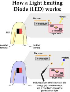
After some research on how LEDs work I made a creative decision to avoid illustrating the active layer and different substrates (Figure 3). I made this decision partly because, as a non-specialist, I don’t understand all of the technical science of LEDs. However, I also thought the most important part of the discovery was the energy difference between the n and p layers. I did mention the InGaN because that seemed important and specific to developing blue LEDs. However, the active layer didn’t seem crucial to illustrate. Please comment if you understand the details and have opinions!
Figure 1 also shows how p and n layers correspond with terms we use more often – anode and cathode. I tried to indicate anode and cathode through my use of color – red and black. But I wasn’t specific about the use of terms. I’m not sure if my attempt came across.
One of the most difficult things to decide in science illustration is what information to leave in and what to leave out. I’ll be doing a separate post on that topic soon.
Communicating Comparisons:
I think Figure 2 is a great way to illustrate increased efficiency in light (lumens) per watt. I like how the differences between light sources were illustrated without using a graph.
I tried to do something similar in Figure 4 but I used a graph. A graph doesn’t seem as intuitive visually as the increasing balls of light around the light sources illustrated in Figure 2.
Another difference is my choice to use “relative energy” rather than specific values in lumens/watt. In addition, my figure compared only an incandescent and an LED light source rather than a series of light sources as in Figure 2.
However, I like how Figure 4 shows that incandescent light actually outputs a large amount of energy but the energy is in a wavelength that we can’t see. This figure illustrates not only that LEDs are more efficient but why they are more efficient (all that wasted non-light energy).
Final Thought:
At some point I may re-explore my LED figures to improve on them. Let me know what you think in the comments!


